For comparing histograms of two data distributions. Simply input the two distributions, and it generates a clear and informative histogram that illustrates the differences between the data.
Usage
compHist(
  x1,
  x2,
  title,
  col1 = "red",
  col2 = "yellow",
  xlab = "",
  ylab = "Frequency",
  separate = FALSE
)
Arguments
- x1
NUMERIC. the first distribution
- x2
NUMERIC. the second distribution
- title
CHARACTER. title of the histogram plot
- col1
CHARACTER. color fill for first distribution
- col2
CHARACTER. color fill for second distribution
- xlab
CHARACTER. label of the x-axis
- ylab
CHARACTER. label of the y-axis
- separate
LOGICAL. whether to separate the plots
Details
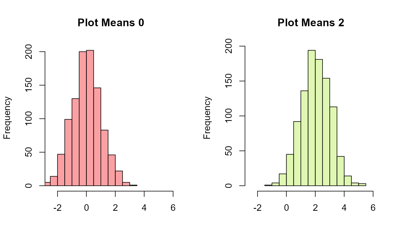
Users have the option to view individual histograms for each distribution before initiating the comparison, allowing for a detailed examination of each dataset's characteristics. This feature ensures a comprehensive understanding of the data and enhances the user's ability to interpret the results of the distribution comparison provided by this function.
Note
- Hexadecimal values can also be passed
in for col1 and col2, see the example section
- For best visual results,
col1 should be a dark color and col2 should be passed as a light color.
For example, col1 = "black", col2 = "yellow"
Some recommended color pairs
col1 = 'dodgerblue4' (and) col2 = 'darksalmon'
col1 = 'brown' (and) col2 = 'beige'
col1 = 'pink' (and) col2 = 'royalblue4'
col1 = 'red' (and) col2 = 'yellow'
col1 = 'limegreen' (and) col2 = 'blue'
col1 = 'darkred' (and) col2 = 'aquamarine4'
col1 = 'purple' (and) col2 = 'yellow'
Examples
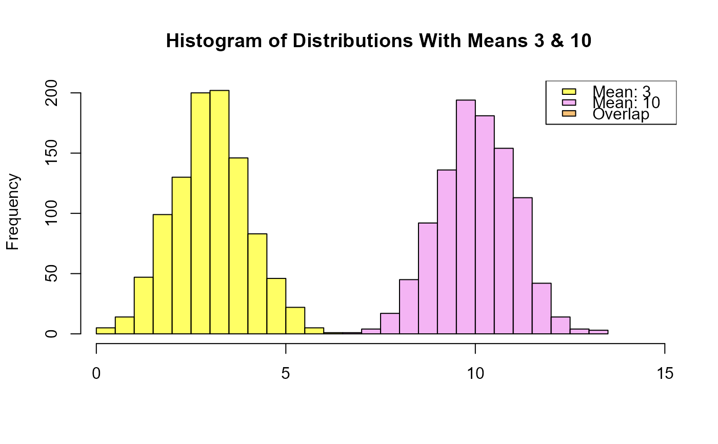
# compare two normal distributions with means that differ a lot
# in this case, the overlap will not be observed
set.seed(123)
compHist(
  x1 = rnorm(1000, mean = 3),
  x2 = rnorm(1000, mean = 10),
  title = "Histogram of Distributions With Means 3 & 10",
  col1 = "yellow", col2 = "violet"
)


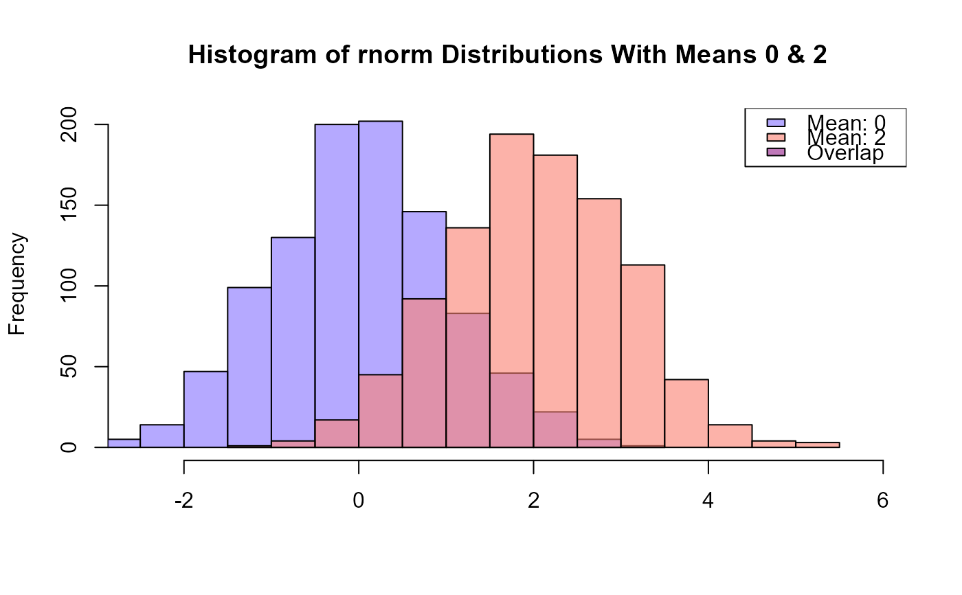
# compare two normal distributions with means that are close
# in this case, the overlap between the histograms will be observed
set.seed(123)
compHist(
  x1 = rnorm(1000, mean = 0),
  x2 = rnorm(1000, mean = 2),
  title = "Histogram of rnorm Distributions With Means 0 & 2",
  col1 = "lightslateblue", col2 = "salmon"
)


set.seed(123)
# separate the plots for preview
compHist(
  x1 = rnorm(1000, mean = 0),
  x2 = rnorm(1000, mean = 2),
  title = c("Plot Means 0", "Plot Means 2"),
  col1 = "#F96167", col2 = "#CCF381",
  separate = TRUE
)
